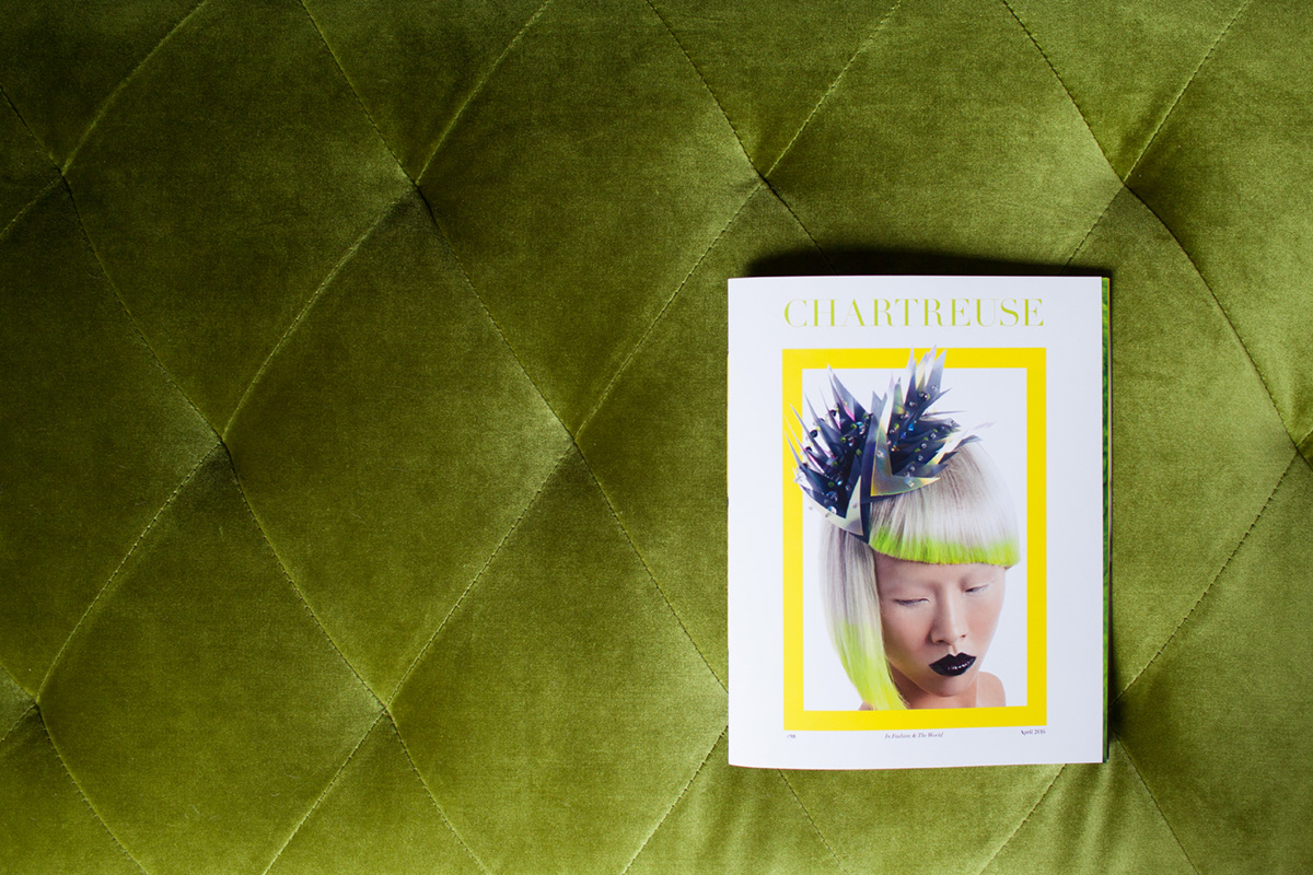
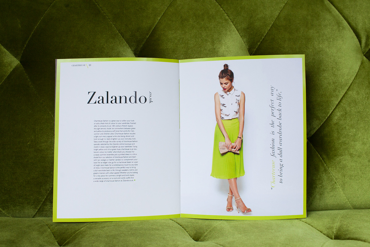
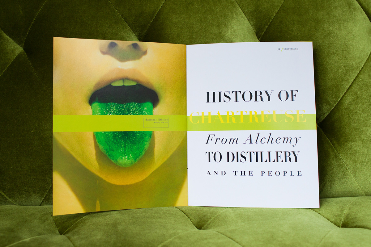
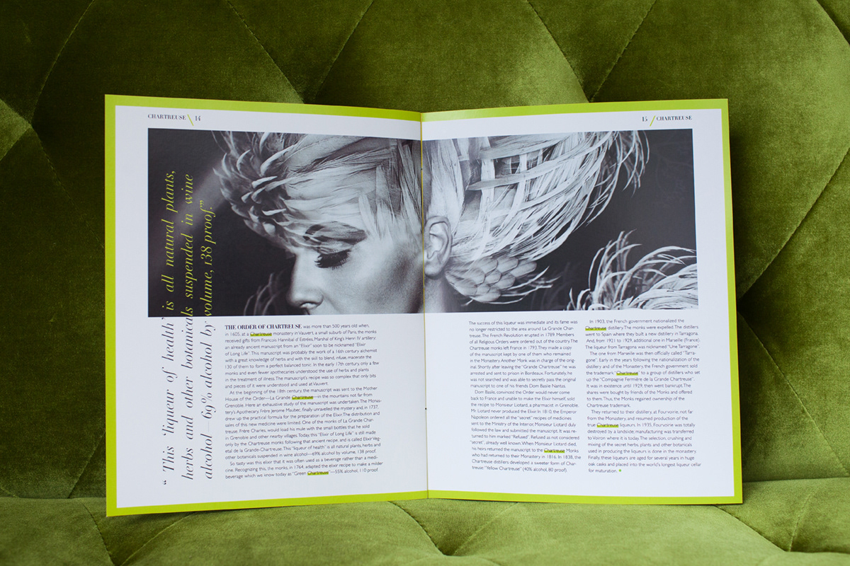
In this Meaning of Color book, I chose the color chartreuse. While fashion magazines were my inspiration I wanted to keep the layout playful and explore layout design in a way that I had not done before. I did this by pairing a classic fashion typeface with a contrasting san serif. I also played with the idea that no one has a clear vision of what the color chartreuse is and that it has now become a spectrum of anywhere between yellow and green. I accomplished this by using varying chartreuse colors throughout.